
The Brief:
A range of visual styles saturate the luxury accommodation and experiences industry. From traditional to garish to modern, the sector is well represented.
The client wanted to see fresh ideas, without reference to their previous designer’s work. With a change to the brand name, the brief is open. Luxurious fonts and soft colours in pinks, creams and greens are preferred, along with a regal “R”.
When resolved, the logo needs to be represented in a variety of ways: inversed as white on a dark background, on signage, in the t-shirt design and on the website. It also needs to cut-through and appeal to all genders.
The Moodboard:
The initial design directions embraced modern and sophisticated typography forming the logo mark to differentiate the brand from the crowd.
Using a pared back aesthetic and plenty of white space, La Riva’s brand vibe is inspired by the colours of the Ligurian coastline and haute couture fashion houses Chanel and Gucci.
These fashion brands communicate ‘authentic luxury’ and constantly evolve through bold designs. Gucci also expresses corporate social responsibility through the sub-brand ‘Equilibrium’, “to bring positive change in order to secure our collective future.”


Initial Designs:
La Riva’s first round of concepts had a sense of elegance and simplicity to ensure the brand essence is carried through all mediums.
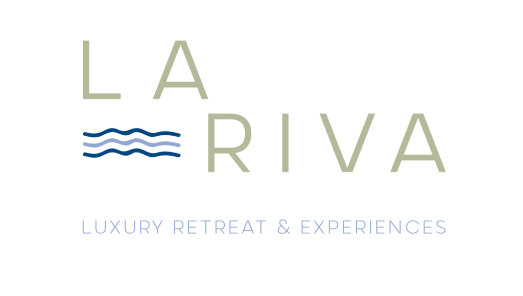
There are references to water in concept one, with simple line drawing waves expressing the ‘Gippsland Lakes Riviera’, whilst remaining fresh and modern.
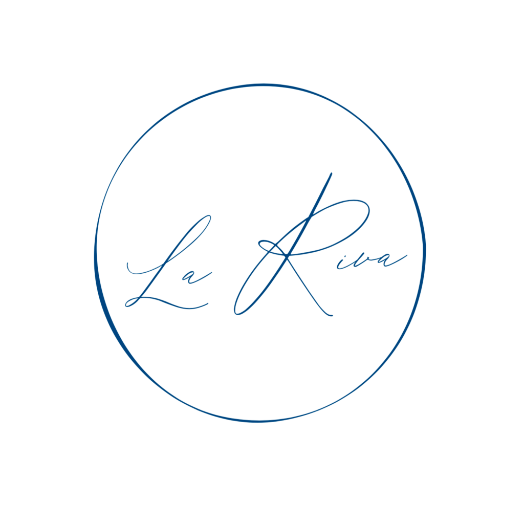
Regal “R’s” adorn concept two, using a stamp style lock-up to ensure the brand will translate across all mediums.
A Roman style font with a flourish element exudes luxury, connection and growth in concept three.
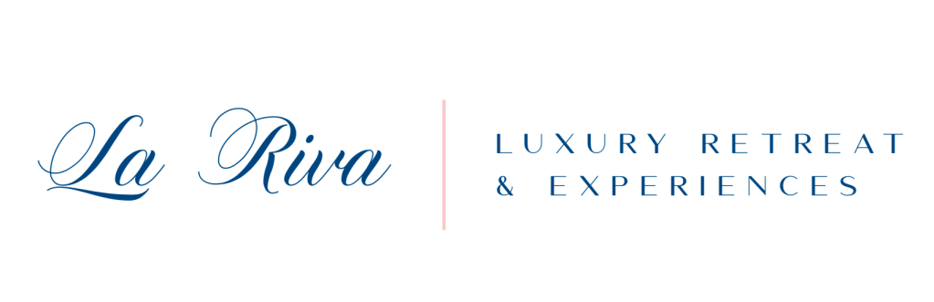
A lavish copperplate brush-script with a clean sans serif brings the brand and value proposition together in concept four.
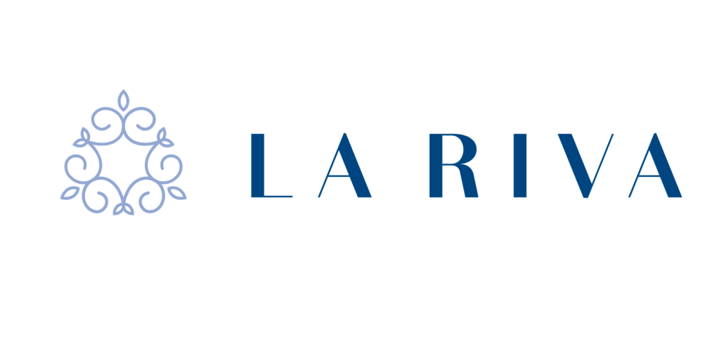
Channelling Coco Chanel, a monogram style brand mark in a modern outlined and sans serif font brings concept five into the equation.

Using Pantone Colour of The Year 2020, Classic Blue, subtle tones of Serenity, Rose Quartz and Olive complement the colour palette.
Final Design:
Through various iterations, the final design outcome was a timeless, clean, bold, stencil typeface with a contrasting colour palette.


Leave a comment