
The Brief:
Dr Paige Williams is a consultant, executive coach, teacher, speaker and author. She uses evidence from neuroscience, positive psychology, leadership and change management theory to help people understand the power of the choices they make every day.
Paige engaged my services to develop her initial brand identity and website. She desired a refined and memorable brand, expressed through colour.
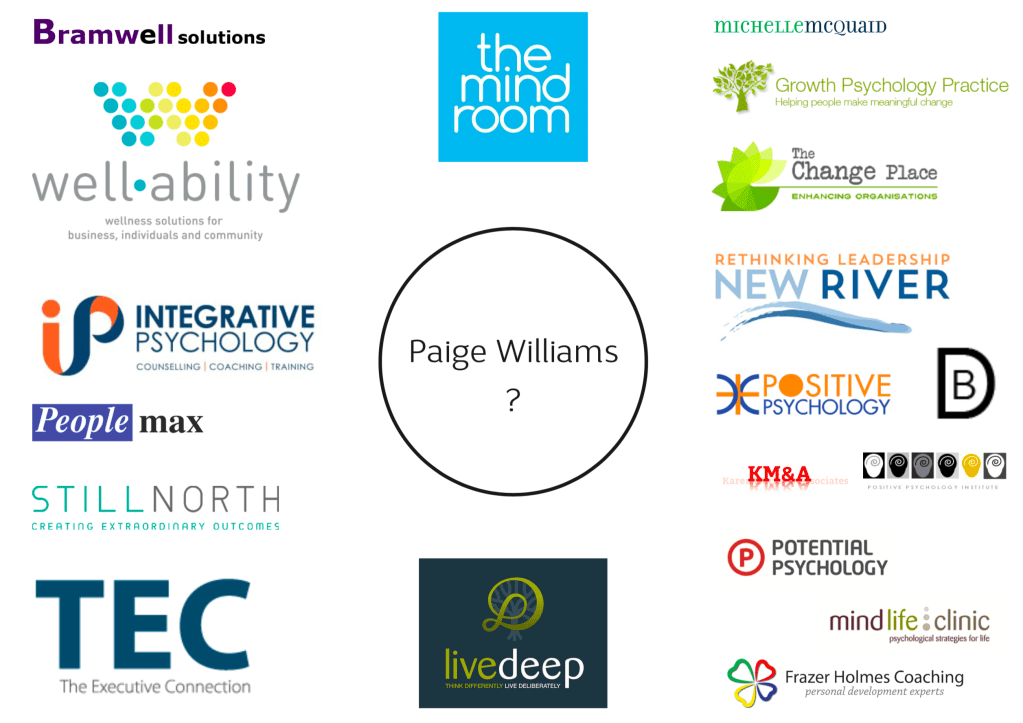
The psychology, positive psychology and organisational change sector is filled with a variety of visual styles.
There are text based logos combined with images of trees, flourishes and growth related circles. As well as references to the brain and the mind and simple text based logos.
Green, orange and purple saturate the health and wellness industry, along with blue to express professionalism and integrity.
The Moodboard:
Through a peaceful, pared back aesthetic, using elegant, clean and uncomplicated fonts, I found relationships between the characters in the words ‘Paige’ and ‘Williams’. The intention was to subtly juxtapose elements to create shape and flow.
Keywords to evoke: inventive, ground-breaking, questioning, thought-provoking, clued-up, informed, erudite, compelling, convincing, clear-cut, effective, warm, professional, knowledgeable, inspiring, expansive, leadership, change, transformation, confident, clarity, sustainable growth, movement, direction, wellbeing, positivity, growth, choice, performance.


Initial Designs:
Text based brand marks, using typography to express elegance and colour to be memorable, were initially developed.
Historically, brands have cultivated memorable impact through colour, pattern or graphics. Think Selfridges yellow, Burberry tartan or the Chanel monogram. A bright blue tone is used in concept one to express integrity, energy and cut through the sea of ‘professional blue’ sameness.
Paige Williams is a ‘silver bullet’ change-agent for organisations and individuals. This is referenced through the pale grey tone.
Marschel Pro font as the primary typeface, with Trenda suggested as the secondary typeface and Futura for web use.

In concept two, references to the ‘all American’ inspiration is expressed through the use of pepper red and blue.
Bw Mitga font as the primary and secondary typeface and Futura for tertiary.

With a pared back colour palette of mint and navy, concept three uses Estampa Script as the primary typeface, with Century Gothic for secondary and Futura for tertiary.

A modern brand mark using marble pattern to emulate exclusivity is defined by concept four.
Final Design:
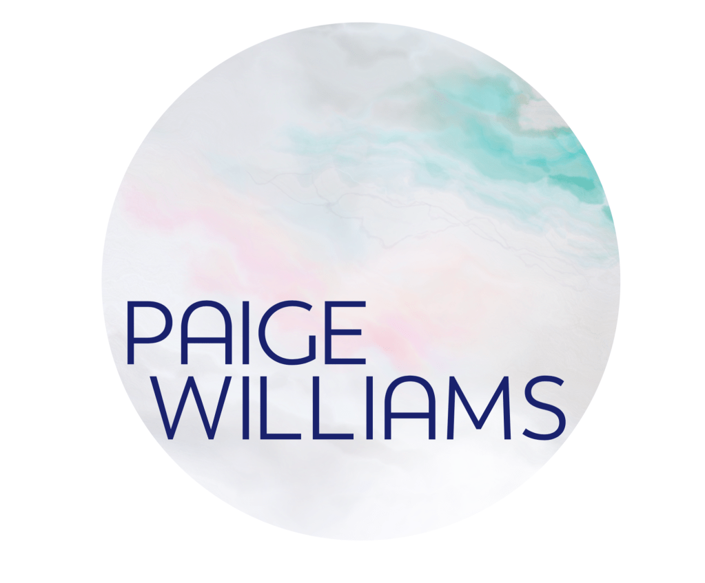
The final design took references from concept one, and blended with a modern script font to create a resonant design.


Leave a comment